

All right. It’s mid-2024. So you know what that means: another new version of iOS 18 coming to an iPhone near you. I’ve been testing the newest version of iOS 18 on my iPhone for the past couple of weeks now. It’s been in beta, and now that the public beta is out, you too can test it on an iPhone before it comes out for everyone in September. But there is some interesting stuff in this version.
iOS 18: Ecosystem-Based Features vs. Independent Features
Last year, I remember talking about how almost every single one of those new features was super ecosystem-based. They would depend on having a friend with an iPhone or having some other Apple device in your life. But it’s kind of the opposite this year. They’re all just basically new features to the iPhone anyway, so we’d love to see that.
For this video, the one thing I’m leaving out is Apple Intelligence stuff. That’s like an entire separate bucket of stuff that, to be honest, hasn’t really been available for me to test in the pre-release betas. So I’m gonna make a separate video just about that stuff as soon as it’s actually testable. Be sure to get subscribed to see that when I actually drop that video. But this video is a top five of everything else.
Top 5 Features in iOS 18
1. The New Control Center iOS 18

The new control center comes in at number five. While there is a good amount of new stuff here, I don’t know if I like all of the new changes. Let me know what you think. When you pull down from the corner, the new control center is first of all, a little bit more colorful and it’s paginated. It’s three pages now.
I’ll honestly probably never really use the second two pages, but they are a full-page visualizer for whatever media is playing and a list of all these one-touch toggles for your basic connectivity. But it actually turns out this full-page list is really just an expanded version of what you already had on the first page, so you can get there with a couple more taps.
On that first page, if you hit the plus button in the corner, it shows a grid. You can play with the size and placement of anything that has a tab in that bottom corner. So they all kind of have these predefined sizes that they morph between, allowing you to design your perfect layout for your control screen. You can add new controls, and there’s a massive list of them to search through and surface things that you do often. Right now, these are basically all Apple app controls.
Apple has said that third-party apps
What I’m more interested in, though, is third-party apps. Apple has said that third-party apps are going to be able to build in controls as well. There are none here now, but I very much look forward to a one-touch control for turning on the AC in the car or opening up the barcode scanner in my calorie tracker app. Just having more controls surface in here will be pretty sweet.
We’ve also noticed this new flashlight control, which, when clicked, allows you to control both the intensity and the beam width of the torch for some reason. The intensity part definitely works. The beam width? I’m not as convinced on that one, but it’s still really cool.
UI Oh, also, there’s a new button up here to turn off your phone, kind of like Android added a while ago in the settings. You can now finally change the controls on your lock screen from the default, which has been the flashlight and the camera forever. You can hold down a customized lock screen and get in there. I hope there are third-party ones that end up here, but there are already a ton of options. I’m excited to set mine to my to-do list app someday.
2. The Passwords App
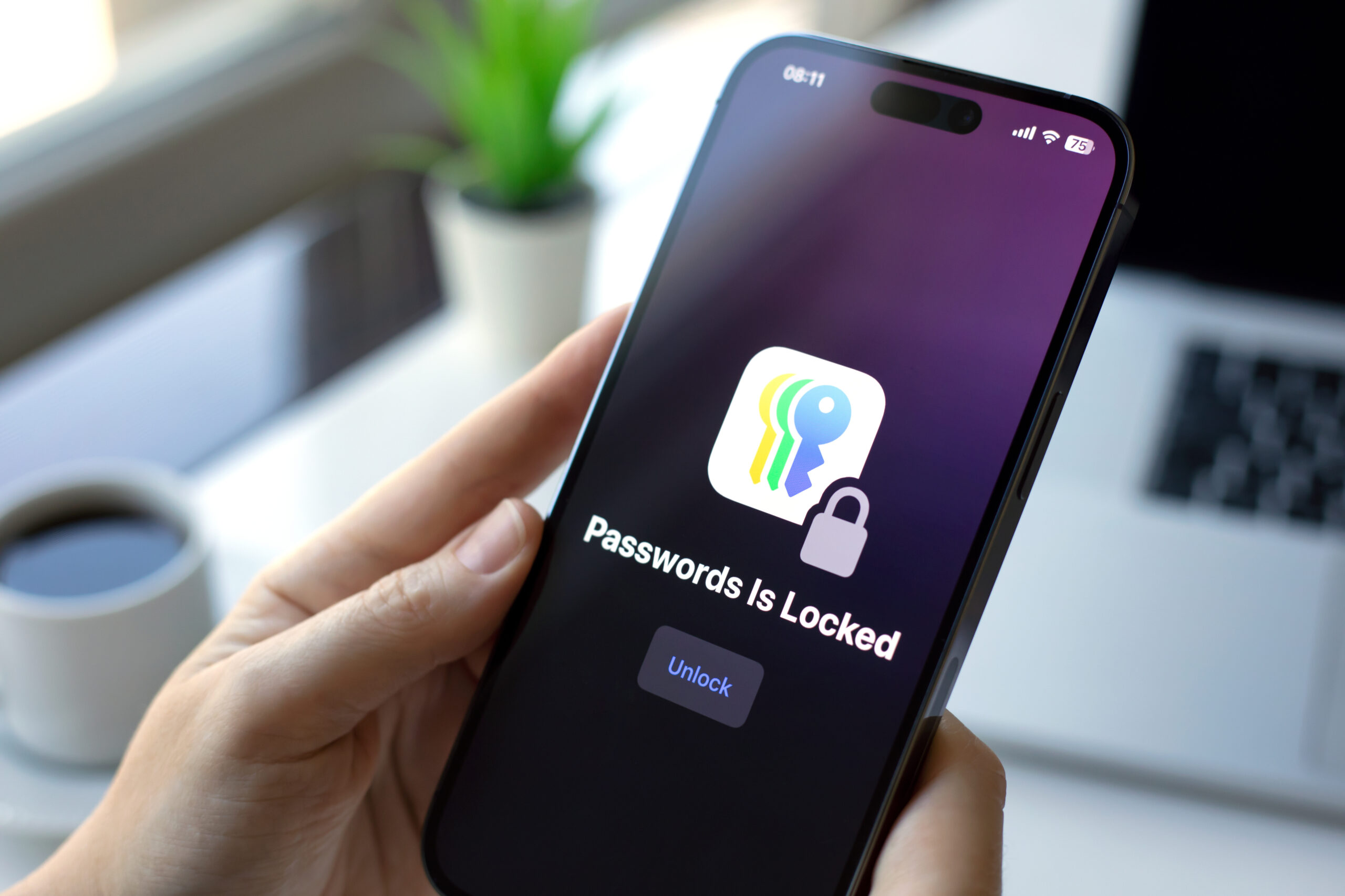
The number four best new iOS 18 feature is the passwords app. Every once in a while, there’s just a new update that installs a new app on everyone’s phones and drops it on your home screen. This is one of them. Essentially, it breaks out all of the password tools that were previously buried in the settings on the phone and makes it an app.
Your iPhone’s been saving your passwords for a while now, saving Wi-Fi passcodes, remembering all this stuff. This app is a super simple way of finding it all in one place, searching through that stuff, and making sense of it. Plus, it also supports some new features. There are two-factor authentication and passkeys. There are a couple of extra things on top that may be good enough to get you to switch from whatever password manager app you’re using on your iPhone to Apple’s Passwords app.
you can create shared passwords
At the bottom left, you can create shared passwords and passkeys within a group of trusted contacts. This works with other people with iPhones anyway. When you’re signing up for a new account, it does the same thing it always does: it offers a super secure password and then offers to remember it for you.
What’s interesting is it doesn’t have a master password. It just defaults to Face ID on the iPhone. If you’ve got Face ID on your iPhone, it’ll ask for that to log in—no master password. The main reason I’m not using this app is that I still use an Android phone. They didn’t make an Android version of this password app. They did make a Mac app and a Chrome extension, which is interesting. But no Android app and I still log into a bunch of stuff on Android, so it’s not for me.
3. New Home Screen Customization
Number three is the new home screen customization. Some of you might have expected this to be higher, like number one or number two, but I have my reasons. Maybe let me know if you agree with them. The day has finally come: there is new customization stuff available to iPhone home screens.
iPhone users can now put their icons anywhere on their home screens that they want. Everything still snaps to the grid, of course, but now you can put icons on the right side or the bottom of your home screen where they’ll be reachable and won’t snap back up to the top.
The mixing of these two looks weird
To customize further, hold down anywhere on the home screen and hit the edit button at the top. Then hit customize. This is the entire home screen customization menu now for the iPhone. You can go dark mode, which tints your wallpaper darker and sets your icons to dark mode, or light mode, which does the opposite. There’s also a large button that makes all of your icons larger and removes the text. Honestly, kind of clean, not gonna lie.
There’s also this tinted button, which feels kind of cursed. This lets you tint the color of all the icons on your home screen to match your wallpaper. There’s even a color picker to drop exactly the same color as your wallpaper. But I haven’t found any combination that looks good. Some icons look fine, but others look completely illegible. It’s the mixing of these two that looks weird.
Google also tried this with Material You in Android, and it also went weird in its own unique way. Basically, it set all the icons to a monochrome version, but if an app didn’t support it, it just didn’t change. So a lot of people had a mix of monochrome and colorful icons, which also didn’t look good. The tinting method could be considered a workaround. I’m sure people will play with this, more icons will get updates, and someday maybe it’ll look great for some people, but I haven’t seen that yet.
4. The Little Things

Number two for me is the little things. There are a bunch of tiny little things and small features that individually are not huge, but they add up to a bunch of useful things in the end. A lot of them didn’t even make the keynote.
- Game Mode
- For example, game mode. When you have a game open, it gives it CPU priority and minimizes Bluetooth latency for any wireless headphones or controllers. It’s a simple thing, but it’s nice.
- Photos App Redesign
- The photos app got a redesign, but I’m more impressed with the smart search inside of photos. It works much better. If I search for something like a license plate, it not only recognizes and finds all the photos in your gallery with license plates but also gives suggestions to narrow it down to find the exact one you’re looking for.
- Shazam Integration
- They added a bunch of shortcuts to Shazam everywhere, including an action button preset as one of the new defaults in the settings app. I thought that was interesting and then remembered that Apple bought Shazam not long ago.
- RCS Support
- RCS support finally appears to be live on the iPhone. It’s going great. It’s still a green bubble, but you can now text between any modern Android phone and an iPhone and get high-quality media. I sent myself a three-megabyte image file from the iPhone, and I got a full-quality three-megabyte image on Android. Typing indicators and reading receipts now work well. Reactions seem to be working. It’s not fully integrated into a blue bubble iMessage, but Apple can now say they finally did it.
5. The Calculator iOS 18
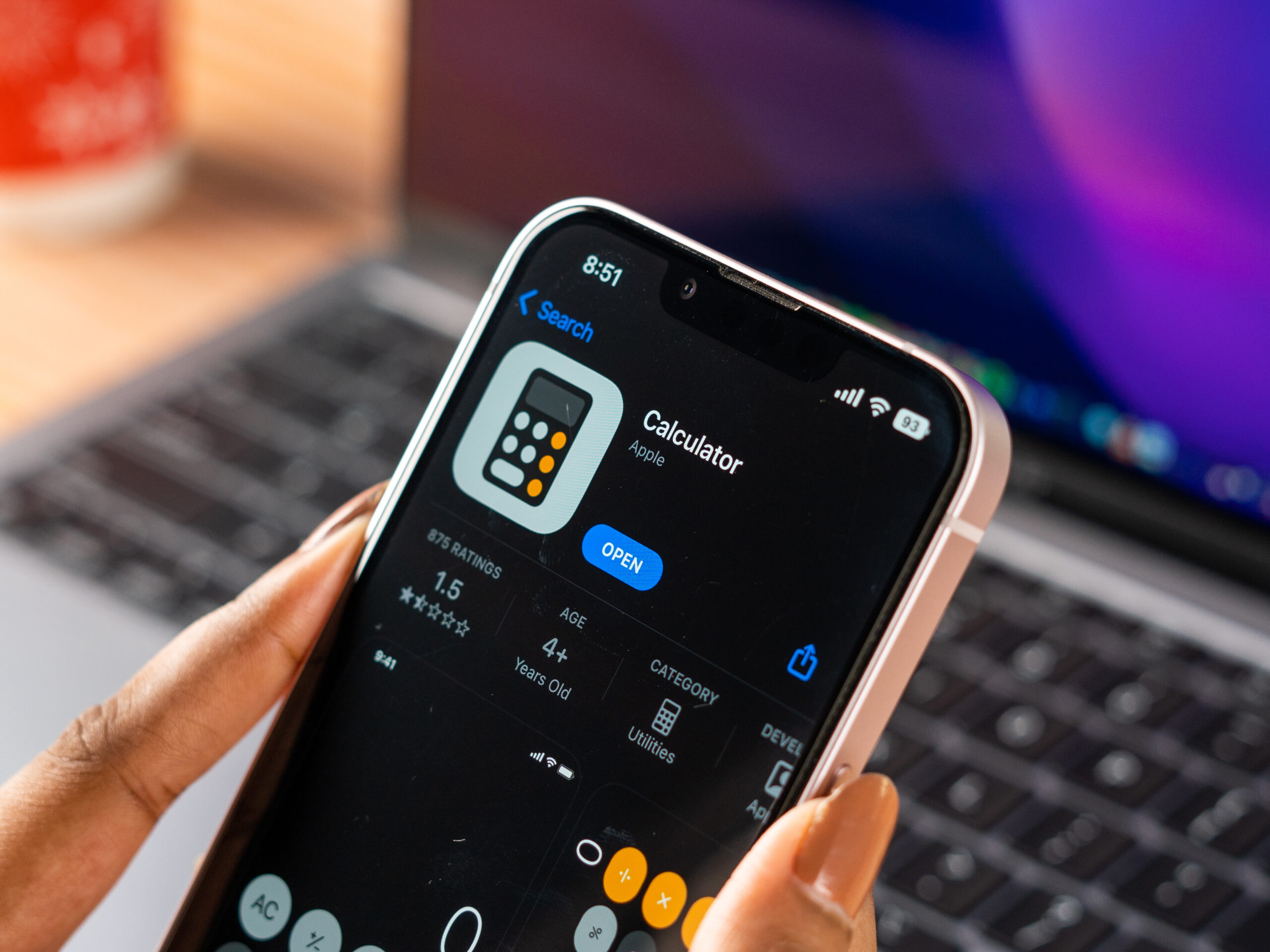
The number one best new feature in iOS 18 is the calculator. It might have seemed like just an iPad thing because we saw it demoed at the keynote in iPadOS 18, but it’s on the iPhone as well. As a default, you open the calculator app, and it looks like a basic calculator. But at the bottom left, there’s a toggle to switch to a scientific calculator.
Or you can switch to this new thing called math notes. It basically looks like a notes app. You can create a new note and start handwriting math notes. If you write an equation and an equals sign, it can automatically solve that equation and keep it updated as you continue writing or typing. It’s pretty sick.
calculator gains a notes section
It does all kinds of other things, from variables to graphs. It’s essentially doing everything I was asking WolframAlpha to do lately. An underrated part of this is how well-considered and intuitive it feels, and it also syncs across devices just like any other note. So your calculator gains a notes section, and if you add notes on your iPhone, they’ll appear on your iPad and vice versa.
If you redefine a variable lower down in the same note, it knows to treat that variable as the new value from that point on, while keeping the old value for everything above it. It’s impressively well thought out. Obviously, this will be easier with a bigger screen and an Apple Pencil, but even on an iPhone, it’s very useful.
I was doing all this stuff in school with a paper notebook and a TI-84, so at the risk of sounding kind of old, I totally wish I had something like this when I was in school. It’s very impressive. recognizing my handwriting, answering the equations I’m asking of it, writing the answers in my handwriting, straightening everything up, and making everything searchable and indexable across my whole phone. It’s pretty sick.
I’m impressed by this more than anything else I’ve seen in iOS 18, so that’s why it’s my number one feature in iOS 18.
Final Thoughts
There you have it—my top five features in iOS 18. There are plenty of other small tweaks and changes that I didn’t cover here, but these are the standout features for me. Like I said, get subscribed to see a deep dive into Apple Intelligence, because this is the thing that permeates the entire iPhone and Apple’s whole ecosystem. That video is coming up soon.
That’s been it for this rundown of iOS 18. What do you think of these new features? Let me know in the comments, and stay tuned for more updates!